JESSY MICEK DESIGN
2014-2017 — UWSP Dining and Summer Conferences
My Role: SR Graphic Designer & Design Coordinator
During my time with DSC, I designed and maintained signage, menus, and graphics across six campus locations, delivering cohesive visuals across web, social media, and print platforms. My role involved leading both branding and rebranding initiatives for multiple DSC locations and campaigns, creating a wide range of materials including wayfinding signage, brochures, posters, labels, maps, payroll cards, and more.
In addition to hands-on design work such as printing and installing design pieces at all locations, I managed project workflows, organized digital files, and coordinated daily communications with directors, supervisors, vendors, and print production teams to ensure smooth execution and consistency. I also worked closely with fellow department designers and managers to create Honorable Mention-winning submissions for the NACUFS annual competition two years in a row. In the second year, I independently designed an additional event book won the organization a prestigious Silver award.
My contributions were recognized with an offer to continue beyond my initial two-year contract in a newly created role—Design Coordinator—a position established specifically for me by the University. In that role, I led a rebrand of the university’s main dining hall and developed a comprehensive resource archive of employee, location, and food photography for organization-wide usage. I also produced a recruitment and promotional commercial for DSC, which was distributed across departments and featured on campus screens year-round, something the organization never had prior.
As for volume of my workload on average, I would produce 25-40 design pieces per week, 3-9 per day, depending on the itinerary, season and demand at that time. In fact, by the end of my time at DSC, I had built a comprehensive portfolio of work that almost surpassed the scale and variety of my academic portfolio—to which I'm still so very proud of to this day.
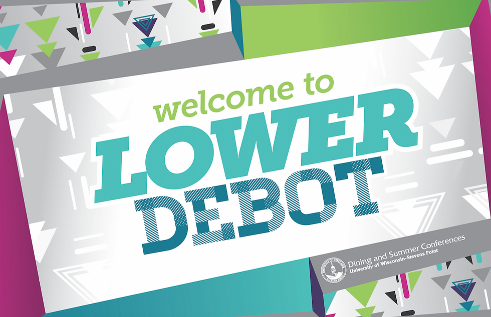
Upper & lower debot
As Senior Designer, I had the privilege and duty of rebranding any of the DSC locations, and after 3 years of seeing the same logo and style guide at Debot, a split-level mess hall in the center of the student dorms, I felt it needed a fun and fresh change! I created a concept that clearly defined the identity and function of each floor through playful, intuitive design. The upper level, open during the day, was branded with an upward-pointing fork icon with a warm, inviting color palette to reflect daylight energy and comfort of it's early-mid-day hours. The lower level, open at night, featured a downward-pointing fork icon paired with a cool-toned palette to evoke a cool, evening atmosphere. This visual system not only enhanced wayfinding and user experience, but also gave the space a cohesive, memorable identity rooted in purpose (to eat) and fun (to hangout with your collage peers).
2016 Upper & lower debot branding


upper debot special event posters
One of my major responsibilities at DSC was designing, a plethora of vibrant, eye-catching posters for the special event dinners held at Upper Debot, each tailored to match that dinner or month’s unique concept. From retro diner vibes to playful, hand-drawn illustrations and mixing various fonts and textures, I had a blast explored a wide range of styles and design techniques to keep the visuals fresh and engaging. My goal was to create designs that sparked curiosity and excitement—posters that didn’t just announce an event, but made students and staff WANT to attend. Each poster was thoughtfully designed to capture the vibe of the evening and build a strong sense of "Certified Cool" that resonated with the young college crowd , elevating the energy around these recurring events. Each event had a successful and significant turnout.


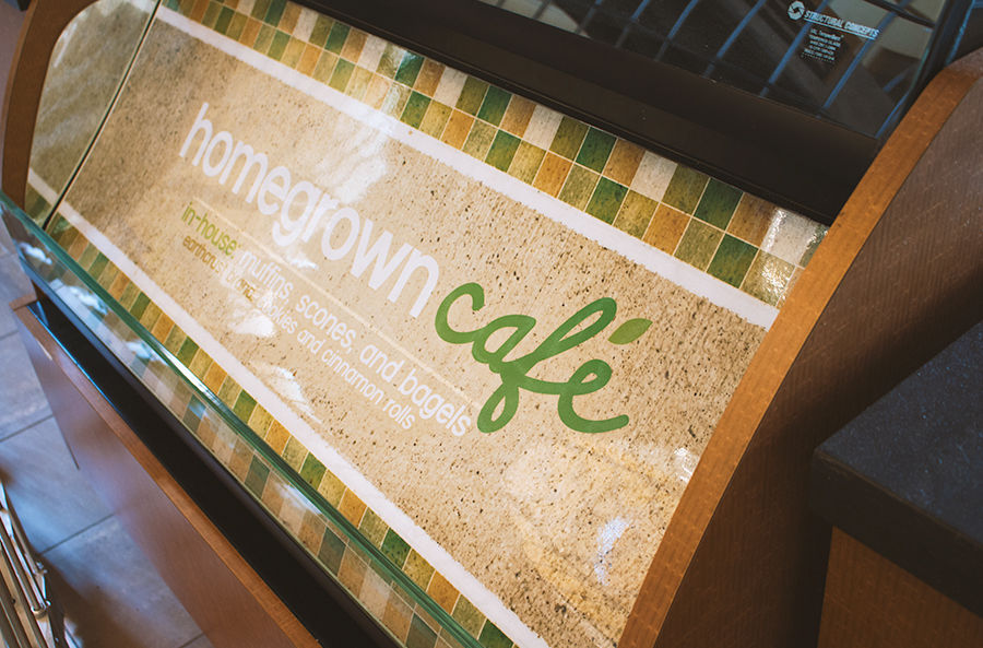
DUC homegrown cafe
During my time at Dining and Summer Conferences (DSC), I had the pleasure of rebranding their main cafes: Homegrown Cafe. The rebrand involved a refresh on the logo, color scheme, and any graphics revolving around the location.
I was inspired by the tiles lining the walls of the cafe, and keeping in mind the idea of "locally grown" and green-friendly, I developed a brand that is friendly and inviting, as well as representational of Dining Services strong aim for local resources and sustainability.

wayfinding signage

posters & wall graphics


buy 9-get-1-free punch cards

rebranding logo & style guide assets


DUC main food court
food court wayfinding signage

food court station branding, menus & signage


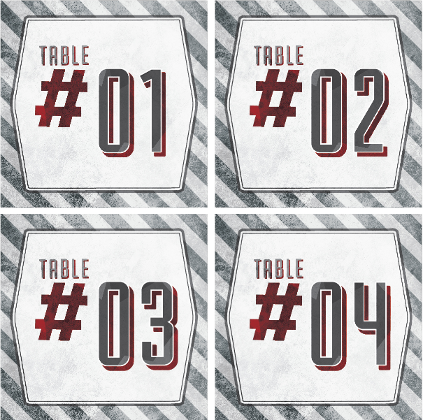
DUC after hours: THE RED VEST
Red Vest To-Go Menu


Red Vest seating chart

Red Vest table numbers
Red Vest Specials (for print)


Red Vest Specials (for screen)

Dsc signage
various promotional & informational printed posters


HIRING & RECRUITMENT print materials


